

User Experience (UX) and Engagement: Turn the Visitors You Already Have into Customers
You have done the hard part: people are arriving at your site. User experience decides what happens next. This guide shows you how to see your site the way a first-time visitor does, find the points where they give up, and fix them in order of commercial value, using your own knowledge of your customers and free tools.
- UX is how easily a visitor can do what they came to do. Better UX means more enquiries and sales from the same traffic.
- Start with your highest-value pages and the main action you want on each one.
- Speed, clarity, navigation, mobile usability, trust and accessibility cover most problems.
- Google does not use bounce rate as a ranking signal, but its systems reward pages that satisfy visitors, and Core Web Vitals are measured directly.
- Watch real behaviour with analytics and session recordings, change one thing at a time and measure the result.
What user experience means for a business website
User experience is the sum of what a visitor goes through on your site: how quickly the page appears, whether they can tell at once that they are in the right place, how easily they find what they need, and how much effort it takes to enquire or buy.
Where traffic already exists, these UX principles become a testing program. For how we run one on a single page type, see landing page CRO services in the US.
Applying these UX principles to a new build is what our conversion web design service in Malaysia does, with the trust architecture local buyers expect and a testing plan from launch.
Turning these principles into a measured programme is what website CRO in Canada covers: the baseline, the test cadence, the bilingual page question and how results are reported in enquiries and sales.
Where traffic already exists, these UX principles become a testing programme. For how we run one on a single page type, see landing page conversion optimisation for Australian campaigns, including the baseline we set before changing anything.
Engagement is the visible result. Engaged visitors read, click through to other pages, use your tools, fill in your forms and come back. Disengaged visitors leave within seconds.
The commercial case is simple. If 1,000 people visit a page each month and 10 of them enquire, lifting that to 15 gives you 50% more leads with no extra spending on traffic. Improving experience is usually the fastest way to get more from the marketing you already pay for, and you are well placed to lead it, because you know your customers’ questions and objections better than any designer.
Related: Website Conversion Design.
If you want the practical next step on this point, our guide on A Beginner’s Guide to Title Tags & Meta Descriptions for SEO Success goes into the detail.
Related reading: Master Content Optimization for Improved On-Page SEO Results — it picks up where this section leaves off.
See your site as a first-time visitor does
Familiarity is the main obstacle. You know where everything is on your own site, so its problems are invisible to you. Three exercises restore a visitor’s view.
- 1Run the five-second testShow your home page or a key landing page to someone outside the business for five seconds, then hide it. Ask what the company does and what they would click next. If they cannot say, the top of the page needs work.
- 2Complete your own main task on a phoneFind a service, check the price or the process, and submit an enquiry or reach the checkout, using mobile data in place of office Wi-Fi. Note every moment of hesitation.
- 3Watch real sessionsA free tool such as Microsoft Clarity records anonymised visits and shows heatmaps of where people click and how far they scroll. Ten recordings of your most important page will teach you more than any report.
Write down what you observe before deciding on any change. The list you end up with is your UX backlog.
Decide what each page is for
A page with a clear job is easier to use than one that tries to do everything. For each important page, name the one action you most want a visitor to take: request a quote, book a call, add to cart, download a guide.
Then check that the page supports that action:
- The headline says what you offer and for whom, in the visitor’s words.
- The main button is visible without scrolling and repeated at natural points down the page.
- The button text describes what happens next, such as “Get my quote” or “Check availability”.
- Competing links and distractions near the main action are kept to a minimum.
- The questions a buyer asks before acting, such as price, timing and proof, are answered on the page.
This discipline matters most on the pages closest to a sale. Our website conversion design service applies the same approach to complete sites.
Speed: the first impression
Before a visitor reads anything, they experience how long the page takes to appear. Google measures this with Core Web Vitals, and the thresholds are a sound target for any site: the main content should load within 2.5 seconds, the page should respond to a tap or click within 200 milliseconds, and the layout should not shift as it loads.
Run your key pages through PageSpeed Insights, which reports these measures from real visitors where enough data exists. The usual causes of a poor result are oversized images, too many third-party scripts, heavy themes or page builders, and slow hosting. Deal with the largest item first and test again.
Speed work pays for itself twice: more visitors stay, and the page meets the standard Google measures. For the detail, see how site speed affects rankings and conversions and our INP optimization guide.
Navigation that matches how customers think
Visitors arrive with a question in their own words. Navigation works when its labels match those words.
Use plain names for menu items: the services or product categories as customers call them, plus pricing, about and contact. Keep the main menu to around seven items. Make sure every important page can be reached within a few clicks of the home page, and add breadcrumbs on deeper pages so people can see where they are.
On larger sites, search and filters become part of navigation. Check your site-search report to see what visitors look for and fail to find; each failed search is a request for content or a clearer label.
Internal links inside your content matter as well. A link from a relevant paragraph to the next logical page keeps a visitor moving and helps search engines understand your site. Our internal linking guide covers how to plan them.
Mobile: where most visits happen
For most businesses, the majority of visitors now arrive on a phone, and Google indexes the mobile version of your pages. A layout that only works on a desktop screen fails most of your audience.
Check the points that cause the most trouble:
- Text is readable without zooming, and lines are not cut off at the edge of the screen.
- Buttons and links are large enough to tap accurately, about 48 pixels, with space between them.
- Forms ask only for what you need and bring up the right keyboard for phone numbers and email addresses.
- Phone numbers are tap-to-call, and addresses open in a maps app.
- Pop-ups do not cover the content when the page opens.
- Menus open and close reliably with one thumb.
Test on real devices, including an older, slower phone. What feels instant on a new handset can be painful on the phones many of your customers carry.
Content people can use
Design gets a visitor to the content. The content has to finish the job.
People scan before they read. Help them: put the answer or the offer first, use descriptive headings, keep paragraphs short and use lists where steps or options are involved. Write the way you would explain the matter to a customer in person.
Pay attention to the small pieces of text, often called microcopy: form labels, button text, error messages, the line under a price. A message such as “Please enter a valid phone number including area code” keeps someone moving, while “Error” sends them away.
Interactive elements can add real value where they answer a customer’s question: a price calculator, a product finder, a booking calendar. Add them where they solve a problem. Our SEO calculators are an example of this approach.
Trust at the moment of decision
A visitor who is ready to act looks for reassurance. If it is missing, they leave to think about it, and many do not come back.
Place proof close to the action: a review beside the enquiry form, accreditation logos near the price, a guarantee next to the buy button. Show who is behind the business with names and photographs. State what happens after the form is submitted and how quickly you respond.
Remove sources of doubt as well: broken images, out-of-date notices, placeholder text and inconsistent prices. Each one tells a visitor the site is not looked after. The same evidence that reassures customers supports how Google assesses credibility; see our guide to E-E-A-T.
Accessibility widens your audience
An accessible site works for people who use screen readers, keyboard navigation or magnification, and for anyone on a small screen in bright sunlight. The improvements help every visitor.
The essentials are well established: text with enough contrast against its background (a ratio of at least 4.5 to 1 for body text under the WCAG guidelines), descriptive alt text on meaningful images, a logical heading order, form fields with visible labels, links that make sense out of context and controls that work from a keyboard. Chrome’s Lighthouse report includes an accessibility check that finds many of these issues in a minute.
In several countries, accessibility is also a legal requirement for some organisations, so it is worth confirming the rules that apply to you.
How UX relates to SEO
It is often said that Google ranks sites by bounce rate or time on page. Google has stated that it does not use Google Analytics data in ranking, and that there is no single page-experience signal. What it does say is that its core ranking systems aim to reward content that gives a good page experience, and it measures Core Web Vitals, mobile usability, HTTPS and intrusive interstitials directly.
The practical link is strong all the same. A page that loads quickly, answers the query clearly and is easy to use is the kind of page Google’s systems are built to surface, and it is also the page that earns links, return visits and recommendations. Good UX and good on-page SEO are the same work seen from two sides: one brings the right visitor, the other makes sure the visit succeeds.
Measure, change, measure again
Treat experience as something you manage with evidence. Set up the measures first:
- Conversion rate per key page: enquiries or sales divided by visits.
- Engagement rate and key events in Google Analytics 4: which pages hold attention and which actions visitors take.
- Form completion: how many people start a form and how many finish it.
- Core Web Vitals: in PageSpeed Insights and Search Console.
- Recordings and heatmaps: where people click, stall and leave.
Then work through your backlog one change at a time, starting with the page that brings the most business. Record the figures before the change, give it enough time and traffic to judge, usually a few weeks, and keep what works. On high-traffic pages, an A/B test gives a cleaner comparison.
Small, steady improvements compound. A page that converts slightly better each quarter is worth far more over a few years than a redesign every three.
A 30-day plan
- 1Week 1: observeRun the five-second test, complete your main task on a phone and watch ten session recordings of your top page. Write your backlog.
- 2Week 2: fix the first impressionClarify the headline and main button on your top three pages and resolve the largest speed problem on each.
- 3Week 3: clear the pathShorten forms, correct mobile tap targets and menus, and place proof beside each call to action.
- 4Week 4: measure and planCompare conversion and engagement with your starting figures, keep what worked and choose the next three items.
If you would like a second opinion on where your site loses visitors, our free SEO audit includes a review of the pages that matter most to your enquiries.
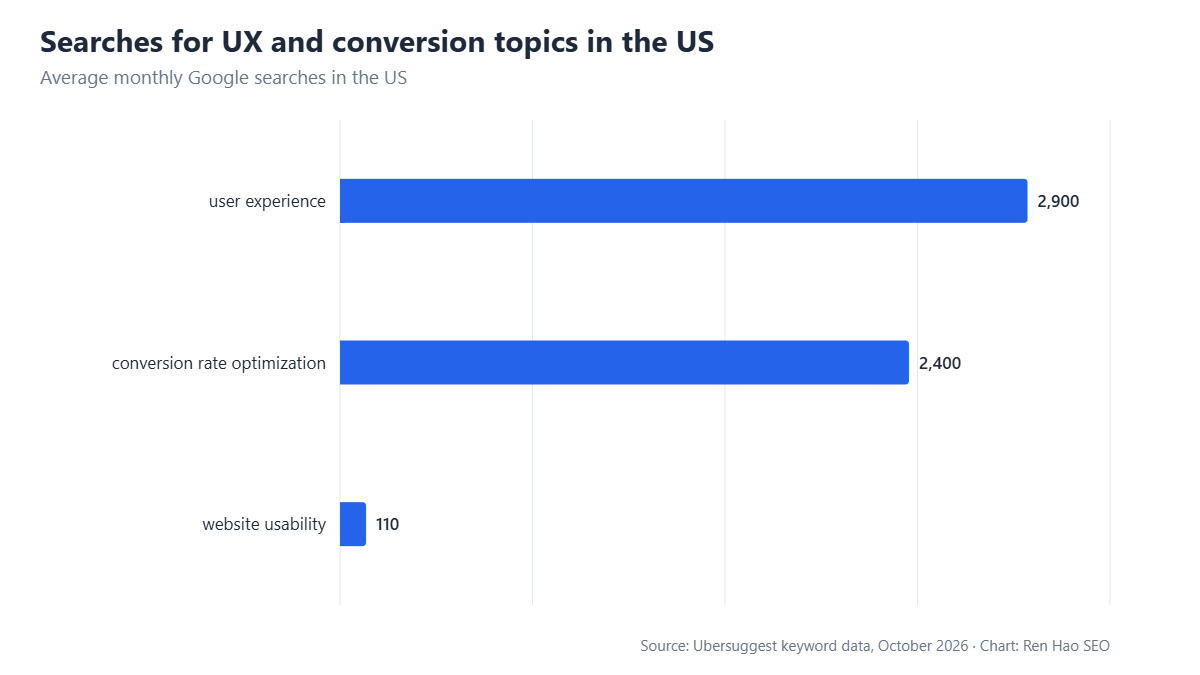
The primary sources for this guide: Google’s documentation on page experience in Search; Core Web Vitals thresholds on web.dev; and the W3C’s Web Content Accessibility Guidelines (WCAG). Search volumes and cost-per-click figures are from Ubersuggest (US, October 2026).
Written by the Ren Hao SEO team and reviewed by Ren Hao, founder and lead SEO strategist. Our guidance comes from real client work — over 100 SEO audits and $1,500,000+ in client sales value generated with white-hat, data-driven methods — not recycled theory.
